Reducing Onboarding Drop-offs in a Digital Banking Platform
Role UX/Product Designer
Timeline 2 months
Team PM, UX, Engineering, Field Ops, QA
Users Site Engineers, Supervisors, Operations Managers
Outcome Shipped and adopted across active projects
Overview
The original onboarding process was rigid and confusing. Users could only log in with a user ID, which many forgot or didn’t have on hand. This caused frequent drop-offs right at the first step.
Once inside, users had to complete a long verification form in one go. Errors weren’t highlighted clearly, and if sessions timed out, users had to start over. The experience felt slow and unreliable — especially on mobile — which reduced trust and led to high abandonment before activation.
Role
I redesigned onboarding to be faster and more user-friendly by breaking the rigid form into simpler, screen-by-screen steps.
Outcome
Users can now log in with a user ID or mobile number, get clearer verification flows, benefit from inline error handling, and enjoy a mobile-first design that feels smooth and trustworthy.
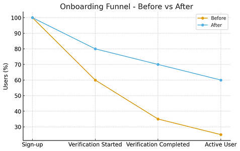
Onboarding redesign grew verification completion from 60% → 82% in 3 months, cut time-to-first-transaction by 35%, and reduced onboarding time by 25%, with strong positive user feedback on login ease and flow.
Research & Insights
Methods
20+ user interviews, 7 heuristic reviews, funnel analysis, and support ticket review.
Key Insights
-
Many users forgot their user ID or didn’t have it saved, causing early login drop-offs.
-
The lack of an alternative login method created unnecessary dependency on support teams.
-
Verification forms were too long and required re-entering information if users made a single error.
-
Session timeouts during verification led to data loss, forcing users to restart.
-
UI inconsistency across web and mobile versions made the experience feel untrustworthy.
-
Users wanted more control and visibility — they preferred confirmation at each step and clear next actions.
Business impact: Lost potential customers → reduced conversion from sign-up to active user.

Key screens
Login Screen — Simplified Entry

A quick-glance dashboard for field workers to track tickets they’ve raised. Status filters and clear ticket cards make it easy to follow progress and stay updated. Dark & light modes support visibility in both indoor and outdoor site conditions.


Get User ID Screen — Self-service Recovery

ICICI Design System

